
Bottom sheet, drawer and modal sheet for the web. One gesture engine with snap
points, spring physics and keyboard accessibility, and the same engine behind
adapters for React, Vue 3, Svelte 5, Solid, Qwik, Preact and a
<bottom-sheet> custom element that works in Angular, Lit, Astro or plain
HTML.






Live demo · API reference · Changelog · Русская версия

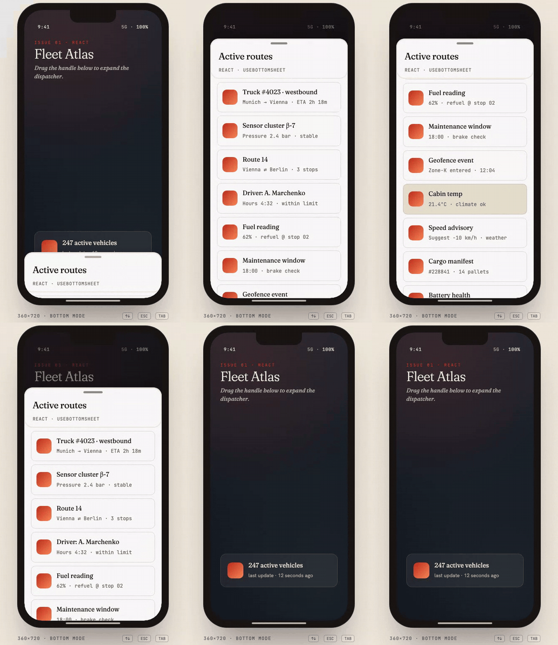
- One engine, every framework. The component you use in React behaves exactly like the one in Vue, Svelte, Solid, Qwik or the custom element, because they are thin adapters over the same core.
- Snap points in any unit. Pixels, percentages,
fit(the content's own height) or any CSS length such as50dvhorclamp(200px, 60%, 800px). - Four edges.
bottom,top,left,right, plusstart/endthat follow the writing direction. - Feels native. Spring physics with velocity carry, rubber-band over-drag, separate thresholds for touch and mouse, motion on the compositor only.
- Accessible. Keyboard slider on the handle, focus trap with restore,
inertfor everything behind a modal sheet, reduced motion, forced colors. - Knows about the phone. Rests on top of the on-screen keyboard, respects safe-area insets, closes on the Back button, locks page scroll the iOS-safe way.
- Stacks. Several sheets open at once, each with its own backdrop and focus scope.
- Small and tree-shakable. 25.6 KB gzip for the full engine, 21.9 KB for the slim core, no runtime dependencies.
npm i @surdeddd/bottom-sheetFrameworks are optional peer dependencies: you install only the one you use.
import { useState } from 'react';
import { BottomSheet } from '@surdeddd/bottom-sheet/react';
import '@surdeddd/bottom-sheet/styles';

export function Filters() {
  const [open, setOpen] = useState(false);

  return (
    <>
      <button onClick={() => setOpen(true)}>Filters</button>

      <BottomSheet
        open={open}
        onOpenChange={setOpen}
        snapPoints={[
          { id: 'closed', size: 0 },
          { id: 'open', size: 'fit' },
        ]}
        focusTrap
        header={<h2>Filters</h2>}
      >
        <FilterForm />
      </BottomSheet>
    </>
  );
}
open needs one snap point of size 0: that is the closed state. A tap on the
backdrop, Escape and a drag down all close the sheet and report it through
onOpenChange.
The maps pattern: a strip at the bottom that the user pulls up.
<BottomSheet
  snapPoints={[
    { id: 'peek', size: 96 },
    { id: 'half', size: '45dvh' },
    { id: 'full', size: '90%' },
  ]}
  initial="peek"
  header={<h2>Nearby</h2>}
>
  <PlaceList />
</BottomSheet>Vue 3
<script setup lang="ts">
import { ref } from 'vue';
import { BottomSheet } from '@surdeddd/bottom-sheet/vue';
import '@surdeddd/bottom-sheet/styles';

const open = ref(false);
const points = [
  { id: 'closed', size: 0 },
  { id: 'open', size: 'fit' },
];
</script>

<template>
  <button @click="open = true">Filters</button>
  <BottomSheet v-model:open="open" :snap-points="points" focus-trap>
    <template #header><h2>Filters</h2></template>
    <FilterForm />
  </BottomSheet>
</template>Svelte 5
<script lang="ts">
  import { BottomSheet } from '@surdeddd/bottom-sheet/svelte';
  import '@surdeddd/bottom-sheet/styles';

  let open = $state(false);
</script>

<button onclick={() => (open = true)}>Filters</button>

<BottomSheet
  bind:open
  snapPoints={[{ id: 'closed', size: 0 }, { id: 'open', size: 'fit' }]}
  focusTrap
>
  {#snippet header()}<h2>Filters</h2>{/snippet}
  {#snippet children()}<FilterForm />{/snippet}
</BottomSheet>Solid
import { createSignal } from 'solid-js';
import { BottomSheet } from '@surdeddd/bottom-sheet/solid';
import '@surdeddd/bottom-sheet/styles';

export function Filters() {
  const [open, setOpen] = createSignal(false);
  return (
    <>
      <button onClick={() => setOpen(true)}>Filters</button>
      <BottomSheet
        open={open()}
        onOpenChange={setOpen}
        snapPoints={[{ id: 'closed', size: 0 }, { id: 'open', size: 'fit' }]}
        focusTrap
        header={<h2>Filters</h2>}
      >
        <FilterForm />
      </BottomSheet>
    </>
  );
}Qwik
import { component$, useSignal } from '@builder.io/qwik';
import { BottomSheet } from '@surdeddd/bottom-sheet/qwik';
import '@surdeddd/bottom-sheet/styles';

export const Filters = component$(() => {
  const open = useSignal(false);
  return (
    <>
      <button onClick$={() => (open.value = true)}>Filters</button>
      <BottomSheet
        open={open.value}
        onOpenChange$={next => (open.value = next)}
        snapPoints={[{ id: 'closed', size: 0 }, { id: 'open', size: 'fit' }]}
        focusTrap
      >
        <h2 q:slot="header">Filters</h2>
        <FilterForm />
      </BottomSheet>
    </>
  );
});Custom element (Angular, Lit, Astro, plain HTML)
<script type="module">
  import '@surdeddd/bottom-sheet/element';
</script>

<button onclick="document.querySelector('bottom-sheet').open()">Filters</button>

<bottom-sheet snap-points="closed:0,open:fit" focus-trap="true">
  <h2 slot="header">Filters</h2>
  <form>…</form>
</bottom-sheet>
The element carries its own styles in its shadow root; no stylesheet is needed. Without a bundler, load it from a CDN:
<script src="https://unpkg.com/@surdeddd/bottom-sheet/dist/element.iife.global.js"></script>No framework
<div class="bs-root">
  <div class="bs-backdrop"></div>
  <section class="bs-sheet" data-mode="bottom" role="dialog" aria-label="Filters">
    <div class="bs-handle" role="slider" tabindex="0" aria-label="Resize sheet"></div>
    <div class="bs-content">…</div>
  </section>
</div>
import { BottomSheetEngine } from '@surdeddd/bottom-sheet';
import '@surdeddd/bottom-sheet/styles';
const root = document.querySelector('.bs-root')!;
const sheet = new BottomSheetEngine({
element: root.querySelector('.bs-sheet')!,
handle: root.querySelector('.bs-handle')!,
scrollContainer: root.querySelector('.bs-content')!,
backdrop: root.querySelector('.bs-backdrop')!,
snapPoints: [
{ id: 'closed', size: 0 },
{ id: 'open', size: 'fit' },
],
initial: 'closed',
});
document.querySelector('#filters')!.addEventListener('click', () => sheet.open());Preact: @surdeddd/bottom-sheet/preact is the React adapter running on
preact/compat (guide). Angular, Lit and Astro use the
custom element or the engine: Angular, Lit,
Astro.
Snap points are the sizes the sheet can rest at. Each has an id you refer
to and a size:
type SnapPoint =
  | number                 // pixels
  | `${number}%`           // share of the viewport along the sheet's axis
  | 'fit' | 'content'      // the sheet's own height: handle, header, content, footer
  | 'full'                 // the whole axis
  | string;                // any CSS length: "50dvh", "clamp(200px, 60%, 800px)"
A point of size 0 is the closed state. A sheet without one cannot be
closed, only collapsed to its smallest point.
Three layers make up a sheet: the sheet itself, the backdrop that dims
the page, and an optional scrim (screen) for content that fades in behind
the sheet, such as a map preview or a blurred overlay.
State is one object: { activeId, size, progress, phase, isDragging, isAnimating }. progress runs from 0 at the smallest allowed point to 1 at the
largest. phase is closed, opening, open or closing.
Every option, method and event below works the same in every adapter. Component
adapters take options as props (focus-trap in Vue templates, focus-trap="true"
on the custom element).
Sizing and position
| Option | Default | What it does |
|---|---|---|
snapPoints |
required | List of { id, size } |
allowed |
all ids | The points the sheet may rest at right now |
initial |
first allowed | The point to start at. A point larger than 0 starts the sheet open, with no open event |
mode |
"bottom" |
Edge: bottom, top, left, right, or start / end |
maxHeight |
none | Cap on the sheet's size: pixels, or a CSS length resolved again when the viewport changes |
radius |
20px |
Corner radius |
fitContentToSnap |
false |
Keep the whole scroll area and the footer reachable at every point, not only the largest. Details |
Motion
| Option | Default | What it does |
|---|---|---|
animation |
"spring" |
spring, ios-spring, material-bounce, snappy, tween, linear |
spring |
preset | { stiffness, damping, mass } |
duration, easing |
220, ease-out-back |
Length in ms and curve (t) => number of the tween animation |
settleAnimation |
off | "waapi" runs the settle as a compositor-driven Web Animation |
respectReducedMotion |
true |
Jump straight to the point under prefers-reduced-motion: reduce |
viewTransitions |
false |
Move between points through document.startViewTransition() where the browser has it |
Gestures
| Option | Default | What it does |
|---|---|---|
dragFrom |
"handle" |
Where a drag may start: the handle, the whole sheet, or zones ([data-bs-drag] subtrees only). [data-bs-no-drag] opts a subtree out. A sheet without a handle defaults to sheet |
dragFromContent |
true |
Whether a touch on the scroll area drags the sheet. Can be set per point: { id, size, dragFromContent: false } |
disableDrag |
false |
Turn the gesture off; methods still work |
rubberBand |
true |
Soft over-drag past the last point |
flickVelocity |
0.65 px/ms |
Speed at which a touch or pen release counts as a flick. A mouse uses a fixed 0.4 |
dragThreshold |
18 px |
A touch or pen drag shorter than this snaps back. A mouse uses a fixed 12 |
Closing
| Option | Default | What it does |
|---|---|---|
closeOnEscape |
true |
Escape closes the top sheet |
closeOnBack |
false |
The Back button closes the sheet instead of leaving the page |
routedTo |
none | URL shown while the sheet is open; Back closes it and restores the address |
closeOnRouteChange |
false |
Close when the URL changes |
persistent |
false |
The user cannot dismiss the sheet: no backdrop tap, Escape, Back, drag or key closes it. close() still does |
disableClose |
false |
Nothing closes the sheet, close() included |
Focus and accessibility
| Option | Default | What it does |
|---|---|---|
focusTrap |
false |
Move focus into the sheet when it opens, keep Tab inside it while it is the top one, and give focus back when it closes. Mark a popup rendered elsewhere with data-bs-focus-allow to let focus go there |
initialFocus |
first focusable | With focusTrap: the element or selector that gets focus on open. The first focusable element is the handle; false focuses the sheet itself |
returnFocusTo |
none | Element, selector or function: where to send focus on close. A focus trap already returns it to where it was |
inertSiblings |
false |
Make everything outside the sheet inert while it is the top one |
lockBodyScroll |
true |
Lock page scroll while the sheet is open |
Backdrop and scrim
| Option | Default | What it does |
|---|---|---|
backdropRange |
[0, 1] |
The stretch of progress over which the backdrop fades in |
backdropOpacity |
1 |
The opacity the backdrop reaches at the end of that stretch |
backdropColor |
rgb(0 0 0 / 0.5) |
Colour of the backdrop; the same as the --bs-backdrop-color token |
screenRange |
[0, 1] |
The same stretch for the scrim |
scrimMode |
"full" |
full screen, above-sheet (stops at the sheet's edge) or off |
scrimPreset |
none | subtle, standard, monitoring, cinematic: colour, blur and range in one |
scrimColor, scrimBlur |
preset | Scrim fill and the radius of its backdrop-filter blur |
scrimInteractive |
false |
The scrim takes pointer input instead of letting it through |
scrimTapToClose |
false |
A tap on the scrim closes the sheet |
More
| Option | Default | What it does |
|---|---|---|
stackEffect |
false |
Scale the sheets behind the top one, like the iOS card stack |
persistKey |
none | localStorage key: the sheet starts where it was left |
autoCollapseAfter |
off | Milliseconds of rest after which the sheet returns to its smallest open point |
linkedSheets |
none | Other engines that collapse when this one opens |
features |
all | Feature list for the slim core |
Component adapters add a few props of their own:
| Prop | Default | What it does |
|---|---|---|
open, onOpenChange |
uncontrolled | Controlled open state. v-model:open in Vue, bind:open in Svelte, onOpenChange$ in Qwik, the open attribute on the element |
snap |
uncontrolled | The active snap point, as a prop: v-model:snap in Vue, bind:snap in Svelte, snap with onSnap$ in Qwik, the snap attribute on the element. React and Solid use the ref |
header, footer |
none | Regions above and below the scroll area (slots in Vue, snippets in Svelte) |
backdrop |
true |
Render the backdrop |
closeOnBackdrop |
true |
A tap on the backdrop closes the sheet |
teleportTo |
none | Move the sheet's DOM out of a clipping or transformed ancestor |
ariaLabel |
"Bottom sheet" |
Accessible name of the sheet |
handleLabel, contentLabel |
English | Accessible names of the handle and the scroll area, for apps in another language |
sheet.open();              // closed → the first allowed open point; an open sheet stays put
sheet.open('half');        // to a specific point
sheet.close();             // → the closed point; without one, the smallest point
sheet.snapTo('full');
sheet.expand();            // → the largest allowed point
sheet.collapse();          // → the smallest allowed open point

sheet.setAllowed(['half', 'full']);        // change where it may rest
sheet.setSnapPoints(points);               // replace the points
sheet.recompute();                         // re-measure a 'fit' point
sheet.setMode('right');
sheet.setPersistent(true);
sheet.setDisableClose(true);
sheet.setDisableDrag(true);
sheet.setRadius('28px');
sheet.setMaxHeight('92dvh');
sheet.setBackdropOpacity(0.6);
sheet.setBackdropColor('rgb(0 0 0 / 0.4)');

sheet.state;               // { activeId, size, progress, phase, isDragging, isAnimating }
sheet.getResolvedSnaps();  // [{ id, size }] in pixels right now
sheet.canDismiss();        // false while persistent or disableClose
sheet.isTop();             // is it the top sheet of the stack?
sheet.destroy();open(), close() and snapTo() return a promise that resolves when the
sheet has landed. They are safe to call in the tick the sheet is mounted.
When setAllowed() or setSnapPoints() takes the active point away, an open
sheet moves to the nearest point that keeps it open.
In components these are on the ref (ref.current.open()), on the element
(el.open()), or on the object the composable returns. Anything missing there
is one call away through getEngine().
sheet.on('open', ({ id }) => {});       // the sheet starts to appear
sheet.on('opened', ({ id }) => {});     // it has landed
sheet.on('close', () => {});            // it starts to leave
sheet.on('closed', () => {});           // it is gone: unmount here
sheet.on('snap', ({ id, size, progress }) => {});   // it settled on a point

sheet.on('dragstart', ({ size }) => {});
sheet.on('drag', ({ size, delta }) => {});          // every frame
sheet.on('dragend', ({ size, velocity }) => {});
sheet.on('progress', ({ value, size }) => {});      // every frame of any motion

sheet.on('before-snap', ({ id, previousId, cancel }) => {});
sheet.on('before-close', ({ reason, cancel }) => {});
Call cancel() synchronously inside before-snap or before-close to stop
the move; reason is programmatic, backdrop, escape or back.
The scroll lock, the focus trap and the history entry go on at open. The
history entry comes off at close; the lock and the trap at closed, when
the sheet is gone. A move reversed half-way fires open or close again, so
the two always alternate.
Components expose these as onSnap, onOpen… props (React, Solid),
@snap, @open… (Vue), onsnap… (Svelte), onSnap$… (Qwik) and DOM events
on the custom element.
The handle is a slider. The arrow that points away from the sheet's edge grows
it (ArrowUp for a bottom sheet, ArrowLeft for a right one), the opposite one
shrinks it, Home and End jump to the smallest and largest point, Escape
closes.
| Topic | Guide |
|---|---|
| Buttons and bars pinned to the sheet's edge, scrim content per state | Anchors and scrim stages |
| Changing the scrim at runtime | Theming → the scrim |
| A lighter slide-up panel without snap points | Overlay |
| Sheets configured per route | Vanilla → sheet manager |
Navigating right after a close with closeOnBack |
Vanilla → waiting for the history |
| Moving the sheet from code, frame by frame | Recipe: programmatic drag |
| Your own engine extensions | Plugins |
| Right-to-left interfaces | RTL |
Everything visual is a CSS custom property. Set them on .bs-root, on a parent,
or on :root; they reach into the custom element's shadow root too.
.bs-root {
  --bs-surface: #18181b;
  --bs-radius: 28px;
  --bs-handle-color: #71717a;
  --bs-backdrop-color: rgb(0 0 0 / 0.6);
}
The engine writes --bs-progress (0 to 1) and --bs-size (pixels) on the
sheet and on .bs-root on every frame, so anything inside the root, such as
the screen layer or a floating button, follows the sheet without JavaScript:
.bs-root .map-preview { filter: blur(calc(var(--bs-progress) * 8px)); }
.bs-root .fab { bottom: calc(var(--bs-size) + 16px); }
Three ready-made looks ship as extra stylesheets:
import '@surdeddd/bottom-sheet/themes/ios'; // also /material, /vercel<div class="bs-theme-ios"><!-- the sheet --></div>All tokens, themes, stacking and the custom element's parts →
What is built in, and what you switch on:
- The handle is a slider. It has a label, a current value and arrow-key
steps, and it is in the tab order. Name it in your language with
handleLabel;contentLabeldoes the same for the scroll area. - The sheet has a name.
ariaLabel, orariaLabelledBypointing at a heading. WithfocusTrapit is adialogwitharia-modal. - Focus.
focusTrapmoves focus into the sheet, keeps Tab inside it and returns focus to the opener on close. In a stack, only the top sheet traps. - The page behind.
inertSiblingstakes everything outside the top sheet out of reach of the keyboard and of screen readers. - Announcements. Each settle is announced through a polite live region.
- Motion and contrast.
prefers-reduced-motionturns animations into jumps, andforced-colorsgets a border, a visible handle and a system focus ring.
A modal sheet should have focusTrap and inertSiblings both on.
A bottom sheet rests on top of the phone keyboard, not under it, so a field
being typed in stays visible. With focusTrap, focus goes to the handle when
the sheet opens, so the keyboard stays down until the user taps a field;
initialFocus="#email" starts in a field instead.
To stop a sheet with unsaved input from closing, veto the move:
sheet.on('before-close', ({ cancel }) => {
  if (form.isDirty) cancel();
});
For React Hook Form and Formik this is one line:
import { useFormGuard } from '@surdeddd/bottom-sheet/integrations/react-hook-form';

useFormGuard(sheetRef, form); // stays put while submitting, stays open while dirtyEvery adapter can be imported and rendered on the server; the engine attaches
on the client. A sheet that starts closed is hidden in the server markup, so
nothing flashes before hydration. This covers Next.js, Nuxt, SvelteKit,
SolidStart, Qwik City and Astro; the per-framework guides have the details,
such as "use client" in the Next.js App Router.
The default engine includes every optional behaviour. If size matters more, start from the slim core and add the features you use:
import { BottomSheetCore } from '@surdeddd/bottom-sheet/core';
import { routeFeature, contentSwipeFeature } from '@surdeddd/bottom-sheet/features';

const sheet = new BottomSheetCore({
  element, handle, snapPoints,
  closeOnBack: true,
  features: [routeFeature(), contentSwipeFeature()],
});| Entry | gzip | What is in it |
|---|---|---|
@surdeddd/bottom-sheet |
25.6 KB | The full engine |
/core |
21.9 KB | Gestures, snap points, focus, scroll lock, scrim, stacking |
/features |
4.2 KB | routeFeature, visualViewportFeature, contentSwipeFeature, contentFitFeature, persistFeature, autoCollapseFeature |
/react /vue /svelte /solid /qwik |
27 to 33 KB | The full engine plus the adapter |
/element |
33.3 KB | The full engine, the element and its styles |
/overlay |
8.4 KB | The standalone overlay |
/webgl |
6.4 KB | Experimental GPU renderer for the sheet surface |
/debug |
0.9 KB | attachDebugOverlay(engine): a live panel of the engine's state |
An option whose feature is missing warns once in development and is ignored.
Chrome and Edge 80, Safari 13.1 (iOS 13.4), Firefox 72. That floor comes from
the ES2020 build and from the APIs the engine cannot do without: Pointer
Events, CSS custom properties, ResizeObserver. Everything else, from inert
to backdrop-filter to WebGL, is detected and degrades.
Support matrix →
| Frameworks | React · Vue · Svelte · Solid · Qwik · Preact · Custom element · Vanilla · Angular · Lit · Astro |
| Topics | Theming · Anchors and scrim stages · Content at every snap · Overlay · RTL · WebGL renderer (experimental) · Plugins |
| Recipes | Ten worked examples: filter panel, checkout, comment thread, navigation drawer, mini player and more |
| Examples | Runnable projects for React, Vue, Svelte, Solid, Lit, the custom element and vanilla |
| Coming from another library | From vaul or react-modal-sheet |
| Project | Architecture · API stability · Browser support · Contributing |
llms.txt is a compact, complete description of the API written to
be read by a model: entry points, every option, the method and event names, and
the mistakes to avoid. It ships inside the npm package, next to this README.
npm install
npm run demo        # the demo site on localhost:5173
npm test            # unit tests
npm run e2e         # browser tests
See CONTRIBUTING.md. Bugs and ideas go to issues.
MIT, see LICENSE.