
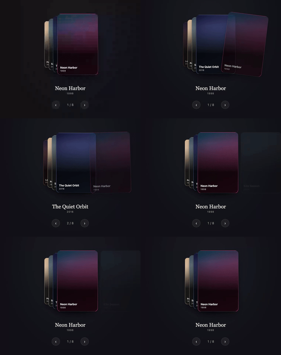
Watch the WebM (sharper, smaller file)




Cards, cascading.
Riffle is a framework-agnostic carousel card stack: a fixed set of cards that cycle through stack positions under a horizontal or vertical drag gesture. The front card sits full size, the cards behind it fan out at decreasing scale, and dragging the front card away brings the next one forward. It is explicitly not a swipe-to-dismiss deck: cards are never discarded, there is no like/nope state, and nothing runs out.
- Feels like real cards. A spring drives every settle, drag velocity carries into a fling, and the grab point acts as a lever: pick a card up near a corner and it tilts as it leaves.
- Small, with nothing to install alongside it. Under 7 kB minified and gzipped, zero runtime dependencies, tree-shakable.
- One engine, three frameworks. Vanilla JS,
@rpxl/riffle/reactand@rpxl/riffle/vueall drive the same headless core. You own the markup and styles; Riffle only writes transforms. - Accessible by construction. ARIA carousel semantics, exactly one tabbable card with
the rest
inert, arrow keys plus Home and End, a polite live region, andprefers-reduced-motionrespected out of the box. - SSR safe. Adapters render from an initial snapshot that matches the engine's first frame, so there is no flash on hydration. Next.js App Router and Nuxt examples included.
- Flexible. Horizontal or vertical, loop or clamp at the ends, custom layouts,
imperative
next(),prev()andgoTo()for your own controls.
npm install @rpxl/riffle
cardWidth and cardHeight describe each card's geometry to the engine (how far a drag
travels, how the fan is laid out) and do not size or style any element: give the cards their
own size, background and radius in your markup or CSS. Every snippet below does.
<div id="stack"></div>import { createRiffle } from '@rpxl/riffle'
const stack = document.getElementById('stack')!
// One grid cell for every card: Riffle positions them from there with transforms.
// justify-content keeps that cell the card's own width (centred), so the fan
// scales about the card itself.
stack.style.cssText = 'display: grid; justify-content: center; padding: 32px 0'
// Name the carousel: screen readers announce this label with it.
stack.setAttribute('aria-label', 'Films')
const riffle = createRiffle(stack, { count: 5, cardWidth: 300, cardHeight: 400 })
for (let i = 0; i < 5; i++) {
const card = stack.appendChild(document.createElement('div'))
card.textContent = String(i + 1)
card.style.cssText = `grid-area: 1 / 1; width: 300px; height: 400px; border-radius: 16px;
background: hsl(${i * 72} 65% 45%); color: white; display: grid; place-items: center`
riffle.registerNode(i, card)
}
// Drag the front card, or wire riffle.next(), riffle.prev() and riffle.goTo(index)
// to controls of your own.import { Riffle } from '@rpxl/riffle/react'
export function Stack({ films }: { films: { title: string }[] }) {
return (
// justifyContent keeps the stack's one grid column, and so every card, the
// card's own width (centred), so the fan scales about the card itself.
<Riffle
aria-label="Films"
cards={films}
cardWidth={300}
cardHeight={400}
style={{ justifyContent: 'center' }}
>
{(film, index) => (
<div
style={{
width: 300,
height: 400,
borderRadius: 16,
background: `hsl(${index * 72} 65% 45%)`,
color: 'white',
display: 'grid',
placeItems: 'center',
}}
>
{film.title}
</div>
)}
</Riffle>
)
}<template>
<!-- justify-content keeps the stack's one grid column, and so every card, the
card's own width (centred), so the fan scales about the card itself. -->
<Riffle
aria-label="Films"
:cards="films"
:card-width="300"
:card-height="400"
style="justify-content: center"
>
<template #card="{ card, index }">
<div class="card" :style="{ background: `hsl(${index * 72} 65% 45%)` }">
{{ card.title }}
</div>
</template>
</Riffle>
</template>
<script setup lang="ts">
import { Riffle } from '@rpxl/riffle/vue'
interface Film {
title: string
}
defineProps<{ films: Film[] }>()
</script>
<style scoped>
.card {
width: 300px;
height: 400px;
border-radius: 16px;
color: white;
display: grid;
place-items: center;
}
</style>Every TypeScript and Vue block above is typechecked against the built package (the Vue
one with vue-tsc, template included) as part of pnpm --filter @rpxl/docs check:api
(apps/docs/scripts/check-readme-examples.mjs), and the package README's copy must match
it, so neither can drift from what actually ships.
6.76 kB minified and gzipped (createRiffle alone, measured by size-limit; see package.json's size-limit field for the enforced budget).
Full docs, API reference and a live demo: https://reactivepixels.github.io/riffle
Issues and pull requests are welcome. CONTRIBUTING.md covers setup, the test suites and the release flow, and issues labelled good first issue are scoped for a first contribution, including Svelte and Solid adapters.